
Wednesday, 27 February 2013
Poster Analyis- Big Bang

From the Big Bang poster I think the genre is sit-com, because the characters all seem to be having a laugh apart from Sheldon on the left who is reading seriously, this could be a comedy scene. Penny seems to be the only one normal person who isn’t a science geek so this could be funny because she wouldn’t understand half the things they talk about.
I can tell this programme is going to be based on science because of the title “The Big Bang” and in the background of the title is has an image of the universe. This is in the centre of the poster because it is the centre of the show and the storylines. It is very brightly coloured and CGI has been used so it stands out from the rest of the poster and it draws your attention to the title before anything else.
The characters have been edited with a carton effect to make them fit in with the comedy theme, along with their facial expressions. Penny is being very over the top and Sheldon is very serious which in reality would be hard. If everyone else was being silly and messing around it would be hard to keep your face straight.
I think the target audience would be between 15-30 and mainly boys. Penny would attract the male gaze to the show because she is wearing quite long cut top and she is blonde. I don’t think the female gaze would be attracted to any of the male characters because they all look geeky and weird for example the way Raj is dressed.
The background it quite dull and boring because they is no colour, this makes the characters stand out because they are all wearing bright colours. They draws our attention to them not the apartment in the background.
All the characters seem to be sat round TV but Penny is in the middle and she is has the main role on the game because she is the singer this could be because she is the main characters or she isn’t clever enough to have another role for example the drums. She is also the only female protagonist which could be why she would be in the centre and she has a lot of lighting on her face which makes her look innocent so we feel sorry for his because she is the only female is she isn’t as clever as the boys.
Poster Analyis - Lost

From the lost poster I think the genre could be Sci-Fi because it looks like they are in a forest but the reflection shows a city. I think the target audience would be both male and females aged between 15- 30 because of the time it is shown. There are many female and male characters that would attract the male and female gaze to the show.
The title lost is in white bold font which stands out from the rest of the poster, it has a stoplight shining down on it, this tells me that the group could be the “lost” and the stoplight could be something looking for them. The title has several scratches on which could me they are trying to escape from something on the island.
At the top of the poster it says “the Wait is over” I think this could mean we have being waiting to see how they escape and what they have been hiding from and it this series I think everything will become clear.
The colours used are all very dark and dull which tells me that the island is dangerous or that it is unknown to everyone else. The characters all seem to be wearing either black or green so they would also blend in with the island and its secret, this makes me wonder what the island is hiding and why?
Even though I can see the island and it looks just a forest the reflection on the sea shows a city, this could be because the characters are looking down into the water thinking about their past and where they used to live.
The characters seem to be posing at the edge of the island; this could be because they are ready to escape or ready to fight whatever is keeping them on the island.
The sky looks a lot brighter than the rest of the poster which is reflecting onto the sea, so we can see the waves and the roughness of the sea which looks like there is going to be a storm. This is making me think that something big is going to happen in this series, or it could be the final series and it could be a shocking ending.
All the palm tree's seem to be blowing quite strongly so they is obviously going to be a storm, but none of the characters seem to be effect, they are only wearing vests and none of them look even moved by the wind. Normally they would be struggling to keep still and the girl’s hair would be blowing unlike this image. This could mean they are standing their ground and not letting the island affect them.
Wednesday, 13 February 2013
Poster Analyis- Waterloo road

From the Waterloo Road poster i think the genre is a drama because the lighting used to make the poster look busy. The location of the image on the poster is in a staff room, i can tell this because the generic conventions used for example tables, chairs, books. I think the target audince would be teenagers or young adults because it is on BBC1 and it is about life in a school therefore teenagers would be able to relate to the situations.
The title is in a smart font like Arial which would be normally used in a school but the some of the letters have be turned and chipped which makes me think not everything would go to plan at this school. It would of started off professional but then the students might have defaced it which makes me think the school might be having problems keeping the school in control.
I think the students would be badly behaved because the teachers all look apprehensive about the day, i can tell this by their facial expressions and the way they are posing. Some of the teachers look like typical teachers with their smart suits and others look more like models. For example the women on the left in the green dress, looks too dressed up. She would attract the male gaze to the TV show and the lighting on her face makes her look innocent.
The two characters who are stood in the middle of the staff room look like the head teachers because they are dressed professionally and they are the only ones who don't look apprehensive about the day. They are both stood back to back which makes me think they have some sort of competition between them, this could add some comedy to the show if they are both trying to outsmart each other.
Analysis of DVD cover- Scrubs
On the front cover of Scrubs there is a group picture of the main cast, the main protagonist is in the middle and the other members have been out behind him. This is because he is in charge and the story will be based around him. He is also the first thing you see when you look at the DVD cover because of the lighting on him. The lighting makes half his face in a shadow and half not, this could be because he has too sides to his personality or because he has some sort of mystery to his character.
We can tell it is based in a hospital because the main protagonist is wearing a green doctor’s uniform and he has a name tag. The background is also green which associated which a hospital because green is a calming colour. The front of the DVD cover is brightly coloured which would make it appealing to look at and it would stand out from other DVD’s.
Then title is in a white, curly font which makes me think this programme will be a comedy which is unusual because usually hospitals are a serious place. I can also tell it is a comedy because the main protagonist is putting his rubber gloves on and it looks like he is being really over the top with it. He also has a comical facial expression which makes me think won’t be a serious character even though he is an important doctor. This creates an enigma of will he be a good doctor or not because usually a good doctor would be serious.
Above the title there is a black banner which has yellow text in; this tells us which season it is. The yellow really stands out against the black background which makes it eye catching.
I think the target audience for this TV series would be men because most of the characters are male and there are two females who are both attractive so this will attract the male gaze. There is also lighting on both females which make them look innocent and attract to the audience.
The spine is a brighter colour of green which would stand out against other DVD covers and the title is wrote in the same front but I think it is hard read. Above the title there are 3 close ups of the main protagonists which have the hospital in the background this lets us establish the location of the series.
On the back of the DVD cover there are no images which makes us focus on the episodes which are also in the original green colour along with the title. The episodes are all numbered which makes it easier to find the one you’re on. Nearly all the episode start with ‘my’ which tells me that it is based around the main protagonist and his view on the hospital. The background is white which is different to the rest of the DVD cover, this makes the text stand out and it still has that hospital feel because green and white are associated with hospitals.

Tuesday, 12 February 2013
Analysis of DVD cover- The Inbetweeners
The Inbetweeners DVD cover has a white background and the front image of all the main characters which is black and white, this makes the image stand out and it is the first thing you see when you look at the DVD cover. The DVD cover is quite simple and doesn’t tell you much about the series but the text is also white and going across the characters which makes it look more detailed than it really is. The only colour on the front is the E4 logo which is quite big compared to other DVD covers. At the bottom it says “basically, they just want to get laid” which is in grey and it faded out into the background so it is hard to read and not as clear as it should be, this gives me the impression that it is some sort of mystery.
The characters are all stood next to each other; they look like they are all in a group and like they have known each other for a long time. They all seem to be wearing quite casual clothing for example jeans and a jumper which tells me they don’t really like fashion and they are not too bothered how they look. The main protagonist Will is the most dressed up because he is wearing a blazer and glasses which tells me that he is the main focus and he is the father of the group who looks out for everyone else.
On the spine the title is wrote in capital letters and it is in black, old fashioned font which makes it stand out, this is simple but takes up the whole spine because of the large font size so looks effective. The rating is also on the spine which stands out because it is bright red and the only colour on the spine.
On the back the episodes are wrote in the middle in black and purple font and they are numbered so it is easy to find the episode you were on. The way the titles are laid out makes the series seem fun and different than other TV programmes. The titles all have simple names like ‘first day’ which make me think the episode will be the opposite and really abnormal.
Down the side of the titles there are five pictures of the scenes from the TV show which would give you some clues to what the series is about. They have a small purple boarder and a shadow which makes they look 3D and it covers up some of the white background so it doesn’t look too plain. Above the titles there are four images of the main characters which have been edited to make the characters look fun, relaxed and a bit stupid which would be funny to watch.

Wednesday, 6 February 2013
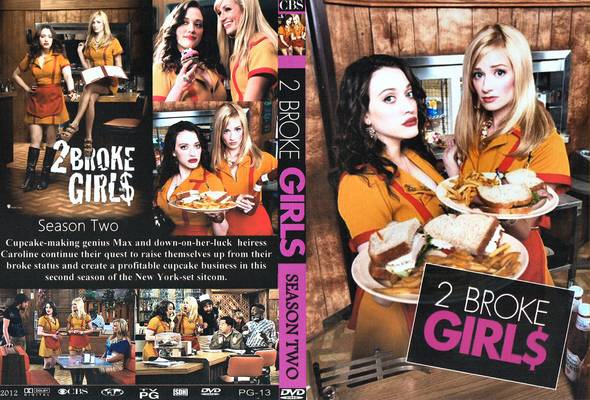
Analysis of DVD cover 2 broke girls
2 Broke Girls
On the front of this DVD cover there is an image of the two main characters Max and Caroline in the diner where they work. I can tell they work in a diner because of the connotations in the images for example the uniforms, bottles of sauce and the oven. We use our cultural knowledge to understand that a café or diner would have all of those things. The lighting makes the diner look rough and like more of a masculine place rather than somewhere they would normally work which makes us feel sorry for them. It also creates the enigma why are they working there?
Caroline’s facial expression makes her look innocent and scared while Max looks in charge and like she is used to it. Max is nearer the camera because she is in charge and Caroline relies on her help. They both look like they are pushing people to buy the food because they need the money and they are both wearing the same uniform. This could be because they are both just waitresses, they don’t have an identity or a personality; they are just they to sell food. Max and Caroline are binary opposites because Max has dark hair, has the power, knows how to look after herself and Caroline has blonde hair and relies on Max to help her.
The title tells us they are 2 girls who need money because they have changed the s to a dollar sign and that is why they would be working in a diner. The lighting on their faces makes them like innocent and this makes us feel sorry for the characters. The title is wrote in black, white and pink which stands out from the rest of the DVD cover and this would usually fit into a girly programme unlike this one.
They both look too done up to be working in a diner because they have both got their hair done and their make up on like they would be working in an office. This would attract the male gaze to buy the DVD cover.
The image on the front of the DVD cover makes us feel sorry for Caroline and Max because they look poor and like they need help unlike the other images on the back of the DVD cover. The image on the left is of them posing, it looks like they are in change and they have power which they didn’t have on the front image. The other images are of the girls working and doing normal girly things which makes us think about the story and if we would like the DVD.
Tuesday, 5 February 2013
Focus group test
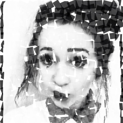
I found out that the image on the front of idea 2 was the most effective because my drama is about a girl trying to find her identity and getting lost in her emotions while doing it. This image is of a girl face in like a jigsaw effect so it looks like she is lost and trying to piece it all together so it fits into my drama.
The title on the first idea was the favourite because they said it makes the DVD cover look more professional and it makes it more appealing to look at. They also like the colours used because they match my image and they are not to bond.
On idea 2 I have wrote which season it would be from on the spine which I think was a good idea because if it was on a DVD shelf you wouldn’t be able to see the front so it would be easy to find without having to take them all out.
I found out that they liked seeing what the characters looked like on the back near the blurb because it helped them imagine the storyline. I am undecided which layout would be best because I don’t want to many images on my DVD cover because I don’t want it to look too busy.


Subscribe to:
Comments (Atom)